Disclosure: this post may contain affiliate links, which means I may make a commission if you decide to make a purchase through one of my links, at no cost to you.
Okay, so we’ve both been waiting long enough for this one. My dining room has NEW PAINT, BABY.

Bla-DOW!
This is the first room where I’ve ever gone BIG with color. I stepped outside my comfort zone of gray (and more gray) and went for deep, moody, vibrant blue. And so far, I’m really, really liking it.
Remember how I did my mom and dad’s dining room using Olympic ONE Paint + Primer? During that same trip to the hardware store, I snagged a gallon for myself as well.
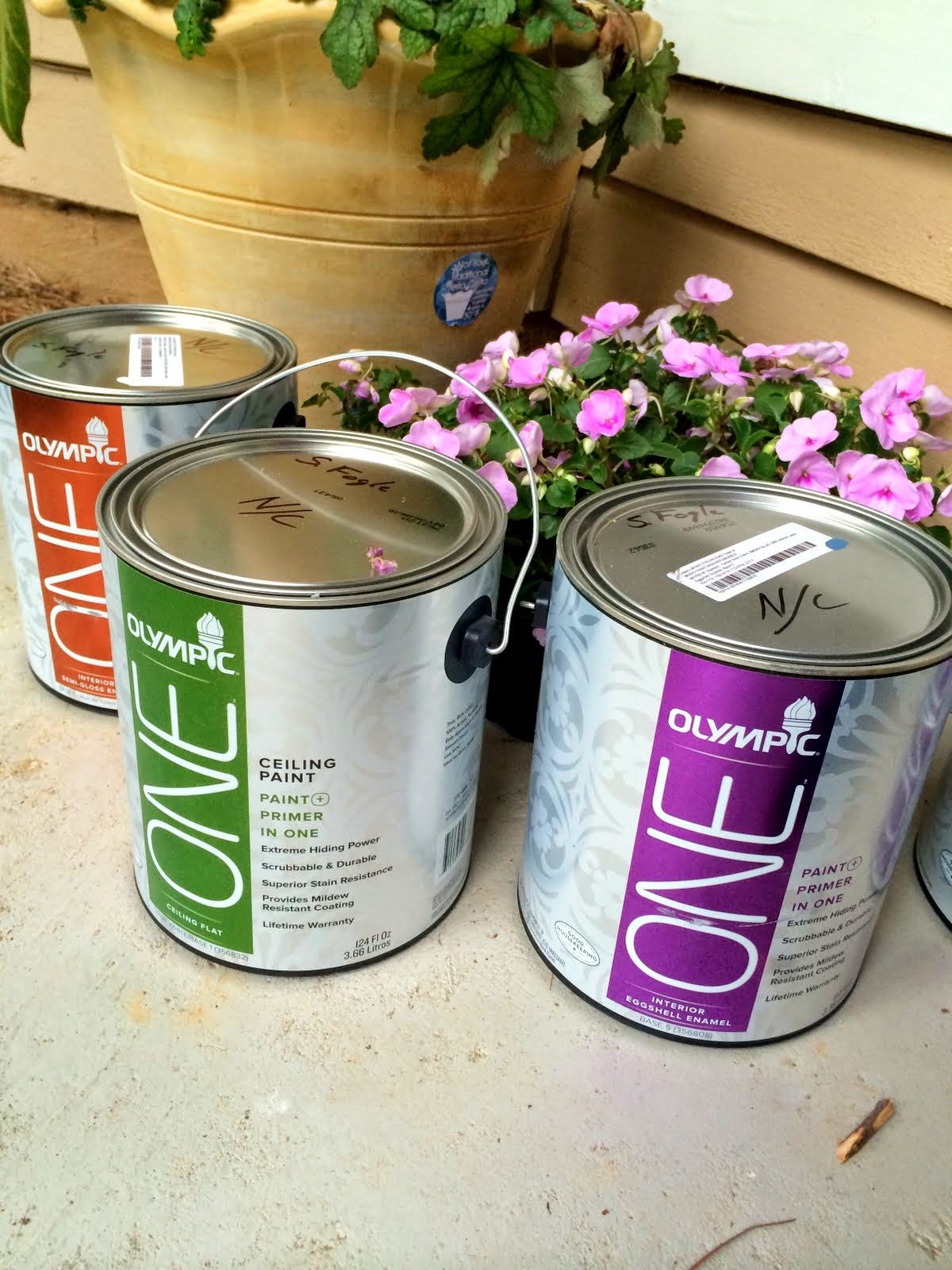
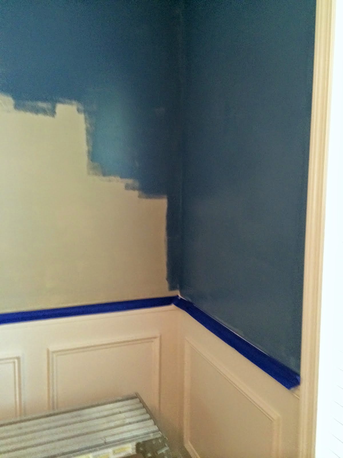
I hadn’t yet chosen the actual paint swatch for the room at the time, so I decided to take a gamble and find out if their coverage really was as good as the claims; if it could take these walls from this:

… to, well, anything that even came close to the deep blue walls I’d been hoping for, I would be satisfied. But I still wondered if I could get the coverage I needed in a single gallon, or if I’d have to spend days trying to fill in patchy areas (always a concern when you’re doing a big color change like this).

After waiting the appropriate dry time from all of the prep and priming work, the walls were sealed and ready to go. I slapped the first coat on and had two initial thoughts:
1. This is definitely the color I wanted (and I’m kind of shocked; without using an actual paint swipe on the wall first, I just picked out my gallon and went with it).

2. The first coat was definitely looking a little… patchy. But the paint was going on nice and thick, and I also noticed that, like my last experience painting at Mom and Dad’s, there was very little splatter (and given the color, I would have noticed for sure).

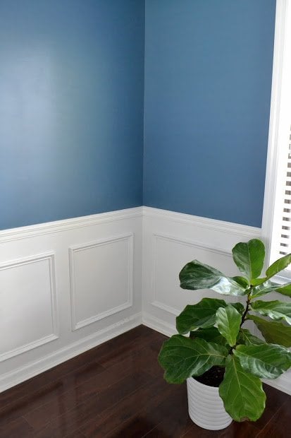
Nonetheless, this isn’t my first paint rodeo. Second coats can make a world of difference. And boy, did it:

I’ve just gotta say it again… bla-DOW.
The paint color, called Smoke Blue (Olympic) was inspired by the curtains I’ve purchased for the room (um, like a year ago). You can see the whole mood board here to see where this is eventually going, though the final wall on the right will need to be finished to put everything back in place (it was just giving me more problems with the drywall repair than the others, but it’s just a matter of executing the solution at this point).

The color itself tends to shift throughout the day (and in these photos). The room gets light from just the one window on the right, so when it’s bright out, the room looks more vibrant. But the window also faces the back yard, which gets a lot of filtered light most of the day, so it tends to look a little more muted in reality. The shadows bouncing around in this room are also a little weird, which is why the pic below looks like it’s got a great big smudge on the wall right where the light hits (even though it doesn’t).

It’s hard to think back on how much effort this room really took. This was how the same corner looked when I moved in and ripped up the old brown carpet:

And now, it’s looking a lot more sophisticated. I’ve still got a number of things to add, like new rugs, a new light fixture, and some art (I’m thinking of DIYing that too). But nothing quite beats a big paint job like this!
In the coming months, I’ll do a recap to show you how the paint has worn over time (or as Olympic likes to put it, #uptothetest). A few other bloggers have been testing their paint out too, so if you’d like to see more, head over to The DIY Village and DIO Home Improvements for more great before + afters.
Disclosure: Many thanks to Olympic paint for sponsoring this post, providing the materials to get the room finished, and for giving me a deadline that forced me to get this room done (seriously). While this may have been done in partnership with Olympic and Good Housekeeping, all opinions expressed here are, as always, 100% my own.


Love the color!
LOVE IT! And that looks like one fine, smooth wall baby! Awesome work and I can’t wait to see it all done with that blue wall. Time to go check out your mood board.
I knew this was going to be awesome. Amazing color and very high end. Love it
Looks gorgeous! And honestly, I have the best luck when I don’t test the color at all and just choose from my paint deck. It’s so weird.
Ooooo love it!!
I love the color. You did a great job. I would love to have dinner in there! :-)
It looks fantastic! We have a similar color in our master and I LOVE it! So dramatic and gorgeous
Bla-DOW indeed! It really pops. All that work was worth it.
Wow!! That looks incredible!
It’s. So. Pretty!!!!!!!!!!!!!!!!!!!! Love the moody, changing color, the crisp white wainscoting, everything is great!
oh it’s gorrrrgeous! well done you :)
What a transformation! All of your hard work was definitely so worth it! Love the choice of colour – definitely bold and beautiful!
Gorge
Congratulations! We know this was hard work and it looks great!
I love the name “Smoke Blue” I think all colors pop against white.
I wonder who is sorry to see that striped wallpaper go the way it did?
Wow! Stunning!
SMASHING! And that’s from a beige gal! With the wainscoting and floor, even if you don’t do another thing you’ve pulled this room into this century!
I bet that wall paper was a pain to get off… The end result looks great, love the blue!
Thanks for this fabulous inspiration. The paint looks awesome.
The color looks great! Are you worried thats it’s not in the typical neutral palette since you’re planning to sell soon?
I’m not too worried, but it was on my mind for sure. The rest of the house is light and gray, so I don’t think the one room will be the thing that throws it (and it’s not as much of a polarizing color as say, peach or green… people typically like blue).
I think you’re fine with the blue, greys and blues are in now.
I seen you have a brass colored therm, ever think about masking and ORBing it?
Details like that make all the difference.
Not really something I thought of doing yet. The thermostat is really old, so part of me likes the charm in how old school it looks. That, plus all of the other fixtures in the house are old brass, so I’m not in a rush to replace/mask things until I know what finish I want everything else to be (if I change it at all).
Love it! And love what you did with the lower part of the walls. Dying to try something like that in my house!
Job Well Done!!! I’m not the best at picturing a room decorated so I guess I will just have to wait and see how great it looks when it’s all finished.
I’m with you on “Bladow!”, it looks fantastic!
I have a very similar colour combination in my own living room (picture on my blog if any are interested, under DIY) and I’m still loving it a couple of years later. Everyone who comes to the house likes the blue room the best, I think. It brings so much life and light, surprisingly. Have no fear about selling it with colour on the wall! :)
Oh, and I totally want to do the lower wall section one day … so much envy :D
What an amazing reveal! You’ve done so much work on the dining room over the past few years – so many headaches! It must be incredible to walk in and see it in all it’s blue glory! Incredible!!! Love the color. Simply perfect.
Amazing colour! Would have never thought to do it such a nice blue. Works so well in the space. Nicely done!
Love the way the blue complements the beautiful dark wood floor.