Disclosure: this post may contain affiliate links, which means I may make a commission if you decide to make a purchase through one of my links, at no cost to you.
I thought I’d share my favorite nerdy tip for picking paint that saves me loads of time and ends the paint sampling cycle!
A secret paint “hack” — every blogger or designer on Instagram seems to have at least one. I’ve spent years thinking I’ve gleaned some good tips, but never thought I’d have a secret-worthy one; I assumed all the things I knew were pretty much common knowledge!
That is, until I shared a tip to a friend about my favorite website for analyzing paint colors, and she told me it blew her mind. So, in the interest of dropping some knowledge where others might not yet know… now YOU’LL know, and can tell your friend to sound like the nerdiest paint expert around.
(Scoffing at them for not being in-the-know is now up to you. 😉)
Ready? Go check out one of my favorite websites in design: Encycolorpedia. If you already know about how genius this site is for paint, feel free to skip to the next post (which will be all about the nursery design). Or, read along, because you even if you already use this website, you may not have used it in all of the fun, geeky ways I’m sharing below.
Since I shared a lot of this info on Instagram this week in my stories, I’ve compiled that series into the video below. I didn’t feel like re-filming it horizontally, so I’ve used the blank space on the screen to add a few extra notes. If you don’t feel like watching the video or are at work and can’t, feel free to read the rest of the post instead! I’ve included lots of details.
Let’s begin! Fair warning: we’re about to get a little (or a lot) nerdy. 🤓 (And no, this isn’t a sponsored post — no shame in that, but mentioning just for the sake of transparency!)

How I Use Encycolorpedia
On its face, Encycolorpedia is pretty straightforward. I started using it because of the web design services I’ve occasionally done over the years. You can type any 6-digit hexadecimal color code (#000000 is black, for example) into the search box, and I’m able to use that info for web-safe color combinations, extract colors from a logo, etc. I won’t go down that path to explain hex codes, but there are 16 million possible colors!
Here’s where it relates to paint: you can also type in the name of a paint color, and it will immediately match it to one of these hex codes — allowing you to extract tons of useful information! Let’s use the same example I used in my video above: Sherwin-Williams Cascades.

Some backstory: I’ve been looking for a paint color for the feature wall in our bedroom for a few months. With having so many color options available between all the major brands, making decisions can be tough! I know I want something both green and blue, and dark, but not so dark it sucks all the light from the room, and a little gray thrown in so that it’s not too vibrant, but still adds color and some oomph. Basically, navy with a dash of green, or vice-versa. Complex. Moody. As you might imagine, there are a number of paint samples that fit this description and lots of brands, but they all differ to the point of feeling overwhelming. Which is the right one for me?
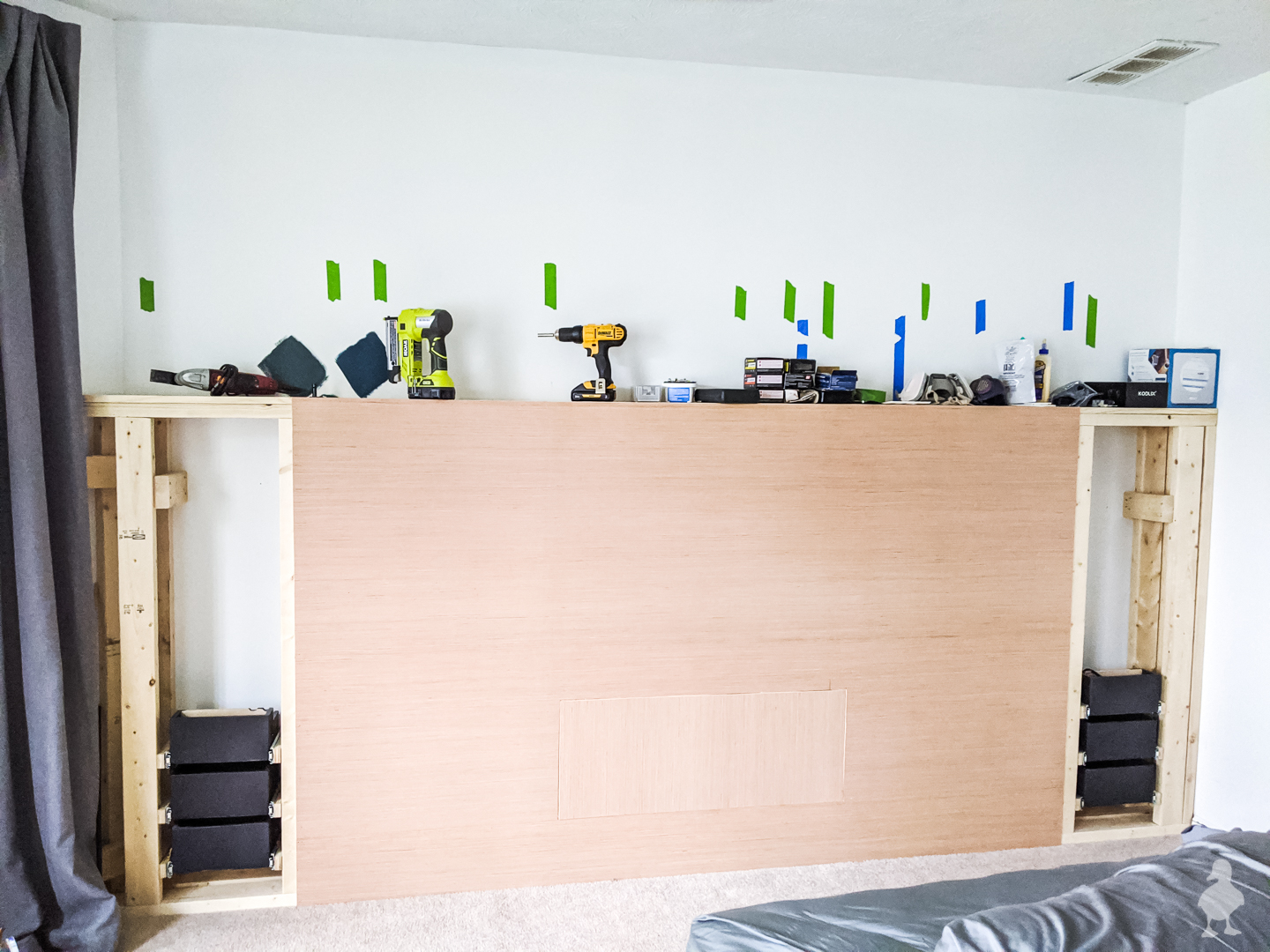
My Typical Paint-Picking Pattern
My usual pattern is to 1) search online, 2) write down some recommendations (often not committed to a particular brand in terms of color), then 3) search the names for images of real-life homes using these colors (thanks to the magic of bloggers and the internet, there are usually a few for each paint color I’m considering). From that list, I narrow it down to a tolerable 3-4 colors to sample, and pick my favorite.
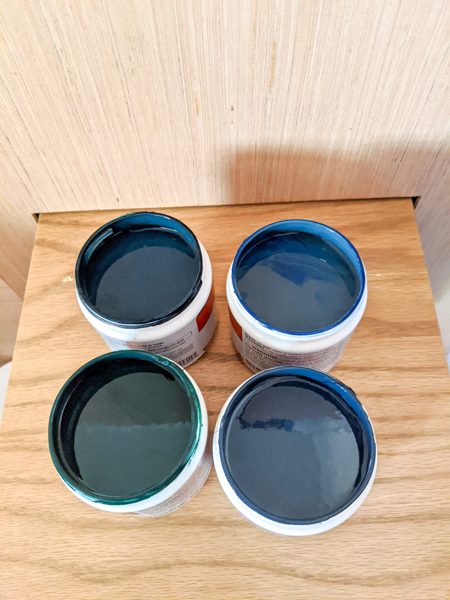
In the case of my bedroom, I did just that. I got to the final step of painting samples on the wall and narrowing down these colors to picking the final one… when up pops the exact color I was looking for as I’m scrolling through accounts I follow on Instagram. And I hadn’t considered this color as an option.
Analysis Paralysis
That wall color looks amazing in Tiffany’s home, doesn’t it???? But would it look that way in mine? How does it compare to my other samples? As I’ve mentioned before, you should always test out a paint color. Just because it looks great in someone else’s home, in their lighting, does NOT mean it will look great in yours! In fact, I have the same navy paint on both my shed and in my office, and they look completely different because of the light. I’ve tried “the perfect white paint” color that seems to be on every top 5 paint list on Pinterest… only to find that it looks dingy and yellowed in my home. It just happens!
Under more normal circumstances, running out to get another sample of paint, just to be sure I covered my bases, is not that big of a deal. But being a pregnant in a pandemic has changed some of those risk factors for “quick errands”. Even before that, I’ve never really enjoyed my 4th trip to the store in the same week (because let’s face it — going to the store for one thing is never my first trip of the week 😂). I can easily get stuck in an endless loop of not committing to paint colors if I think the perfect one is still out there!
How I Compare the Closest Sample I Already Have
Rather than get stalled by indecisiveness yet again, I head to Encycolorpedia and type in the color in question. It helps me see the amount of green, blue, saturation, lightness, etc. And the best part: when I scroll further down the page results, it lets me see what colors by other brands it’s similar to! Some are near-identical matches (indicated by a star ★), and some are close, but it’s easy to visualize the differences this way. I know that some of these brands in the below screenshot may not be the ones that immediately spring to mind… but trust me, they are ALL listed!
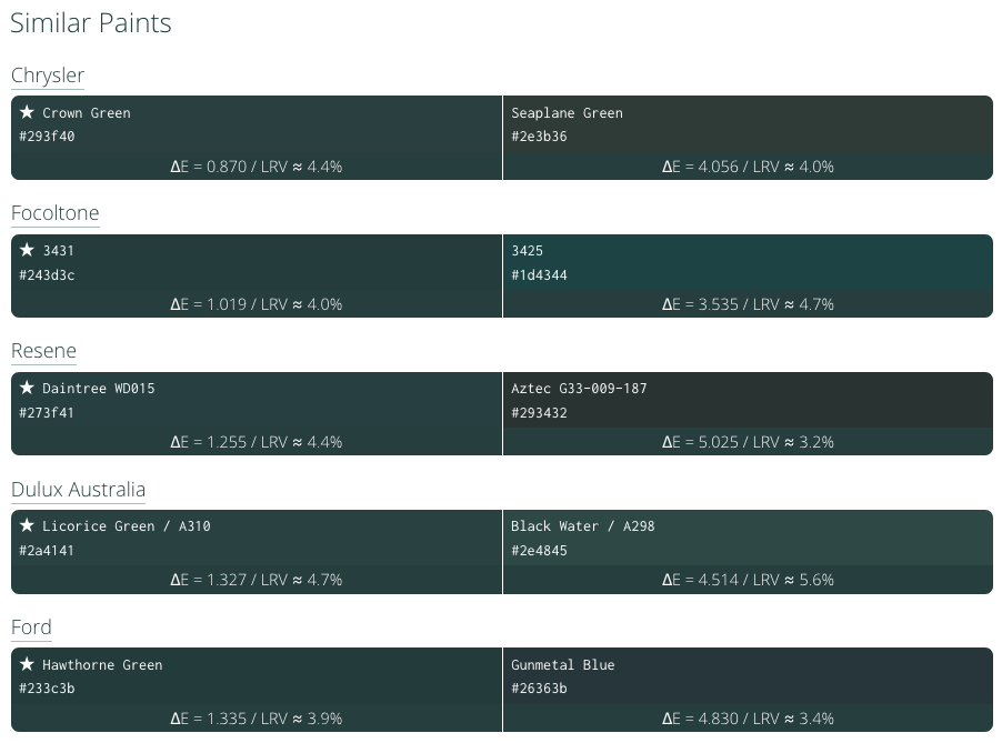
The data is ridiculously helpful! In my video above, I was able to see that I’d already used a sample in my list of four that was close enough to know (by comparison) if the new sample would be more green/blue, lighter, etc. Since I’d already tried a sample of “Salamander” on my walls, which I rejected for being too dark for the room, I could make a good guess that I probably wouldn’t be satisfied by running out and getting SW Cascades to test after all (to be fair, it would be lighter, but not enough for the color I truly wanted). I have a small number of color decks at home as well, and it pointed me to similar colors that I already have swatches of here at the house.
Prevent Too-Intense Paint Mistakes
Another way I’ve used this site is to take a color I like and reduce the saturation. I think I first learned this tip from Young House Love (?) that a vivid color on a paint swatch can sometimes seem perfect — until you get it painted in the entire room, and it’s way too intense! So, it’s wise to go a little grayer or pick something with a little more beige instead. The step-down approach can work well, especially if you’re not used to picking brighter paint colors. This website can help me do that, too; it’s got a section for increasing saturation, decreasing, lightening, darkening, and more. I can keep going in any direction, and then find the closest paint color to match, of any brand.

Find the Color Match to the Brand I Prefer
If I have a favorite paint brand (or line of paint) that I want to stick with for the color, I can immediately find the closest paint match if I don’t trust that color matching will be accurate enough (or if I’m working with a brand and need to use something within their own line of paint). Just FYI, but most of the big box stores now have color matches to most major paint retailers on file, so you often don’t need to worry about having a sample in hand (though I did have to do that recently with a brand new color that was just released and hadn’t gotten into their systems yet). Whatever works for you!
Special Paint Accents
But wait… there’s more! Want to see a full monochromatic scale, such as if you’re thinking about a gradient? Or find complementary colors? Or the exact opposite on the color wheel? It can do all of those things.
*(Laughing at myself for sounding like an infomercial)

Sure, there are paint apps you can download that do color palettes, but those are often specific to a single paint brand. Just about every brand I can think of off the top of my head has their own paint app, but they won’t match to a different brand if there’s a closer color match. That’s why I prefer this site.
(P.S. On the web design side, some of my favorite sites for color palette making are Design Seeds and Coolors — which again, you can use hex codes and then find paint for in Encycolorpedia. If you are looking to create your own, this may be another option.)
Branding for Small Businesses
This last one may not be of interest to most homeowners, but it’s great for small businesses and shops! When I finish off my garage workshop, I plan to use this site in the opposite way as above. Since I want to “brand” the space for more consistency when I make DIY videos, I plan to match the color codes in my logo to paint colors, and then paint items around the room (storage areas, the door, etc.) to match my logo to perfection. So the hex codes will come first, and the paint colors will be generated from there.
That, in a nutshell, is how I use one of my favorite sites for picking paint. And now, you can too! Nerdy, but neat, right? Hope that helps! Stay tuned, because I just finished the nursery mood board this week too, and that post is coming next! I haven’t decided if I’m revealing the sex in that post or not, but I’m considering it!


This came at the perfect time for me – I am starting a couple print projects for a client group and I always have struggled with picking colors. Thanks!!!
Glad I could help!
Thanks for sharing !