Disclosure: this post may contain affiliate links, which means I may make a commission if you decide to make a purchase through one of my links, at no cost to you.
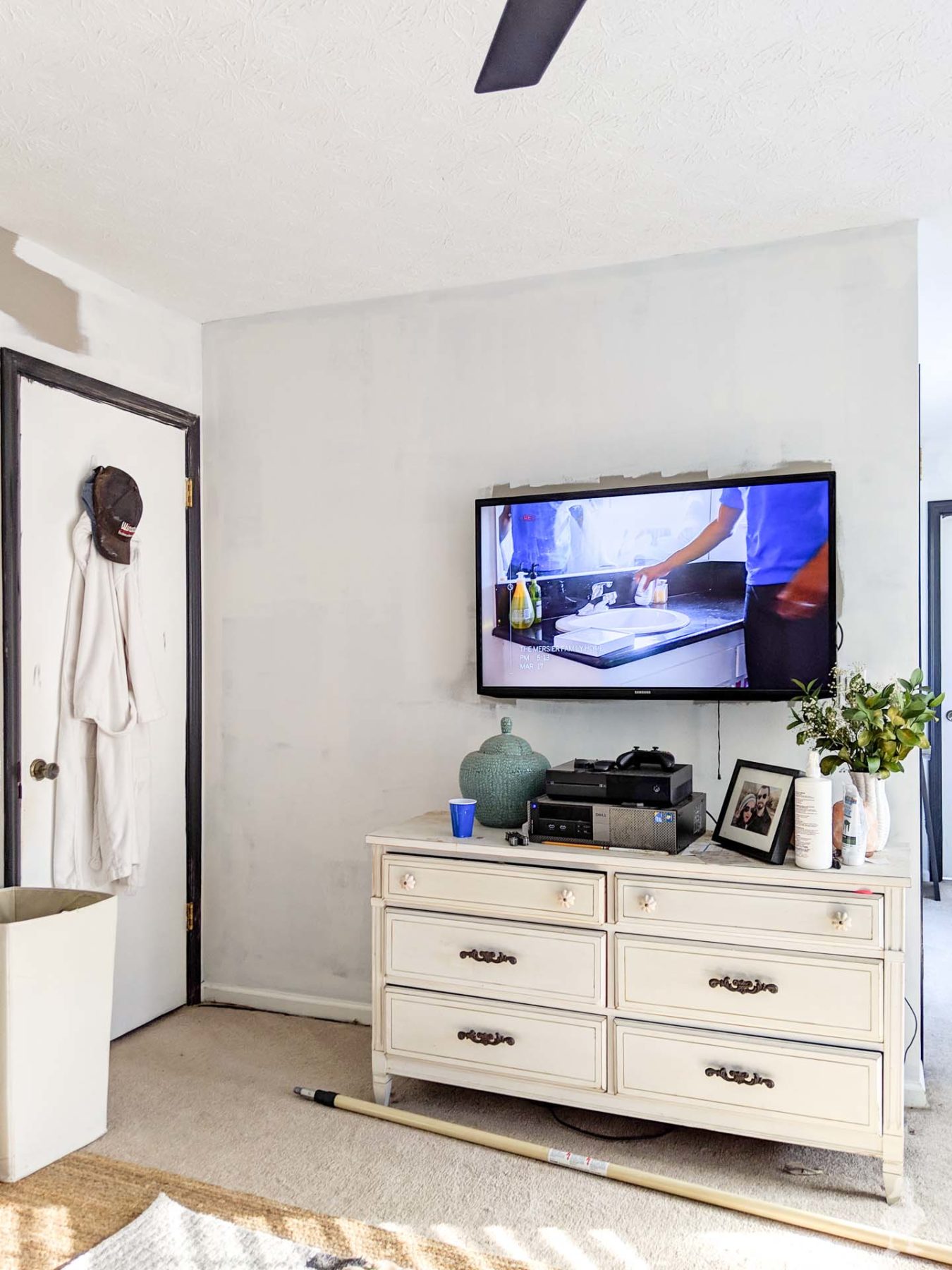
The primary bedroom makeover continues with new black paint on the trim, white paint on the walls, window frost, and a new ceiling fan.
Hope you’re having a good start to the week! As for me, I’m taking a break from painting to show you guys a quick update on what’s been going on around the UDH!
Primary Bedroom Progress
As I mentioned in my 2018/2019 roundup, I’ve been working on the primary bedroom as one of my first projects of the new year. You’ve already seen the new bed and new rugs, as well as the overall design plan. But there are a few other new additions that are inching me closer to a finished makeover.
New ceiling fan
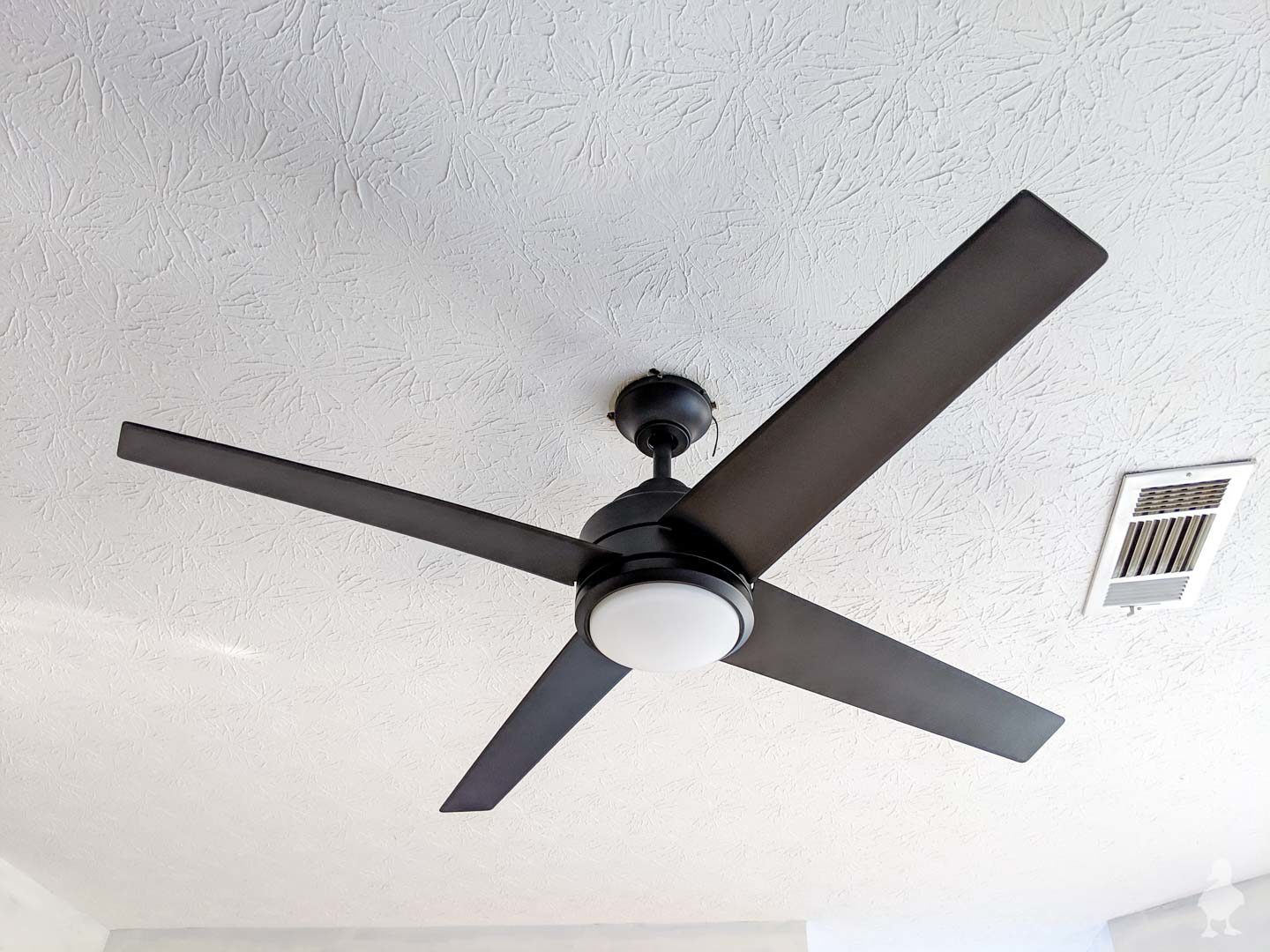
First things first: the boring old boob light was replaced with a remote ceiling fan! THIS is the exact one. I loved the ceiling fan in the guest room so much that I went looking for a similar style, but matte black, to put in the primary.
Tip: I got a GREAT discount on my ceiling fan by finding the one I wanted online and then searching for the exact model on eBay. Saved me about $85 — just make sure you check the seller’s notes to verify that it’s new (open box but unused).
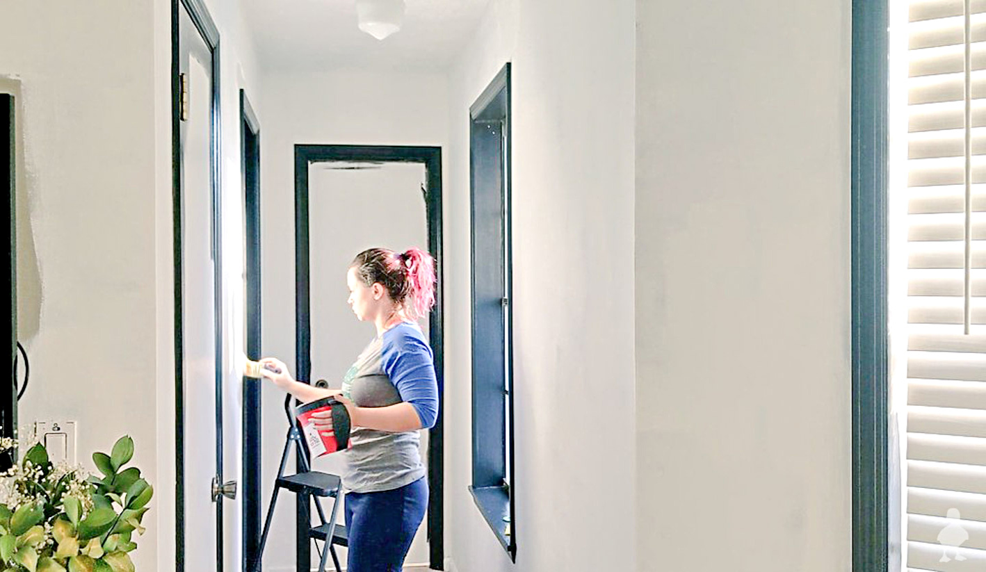
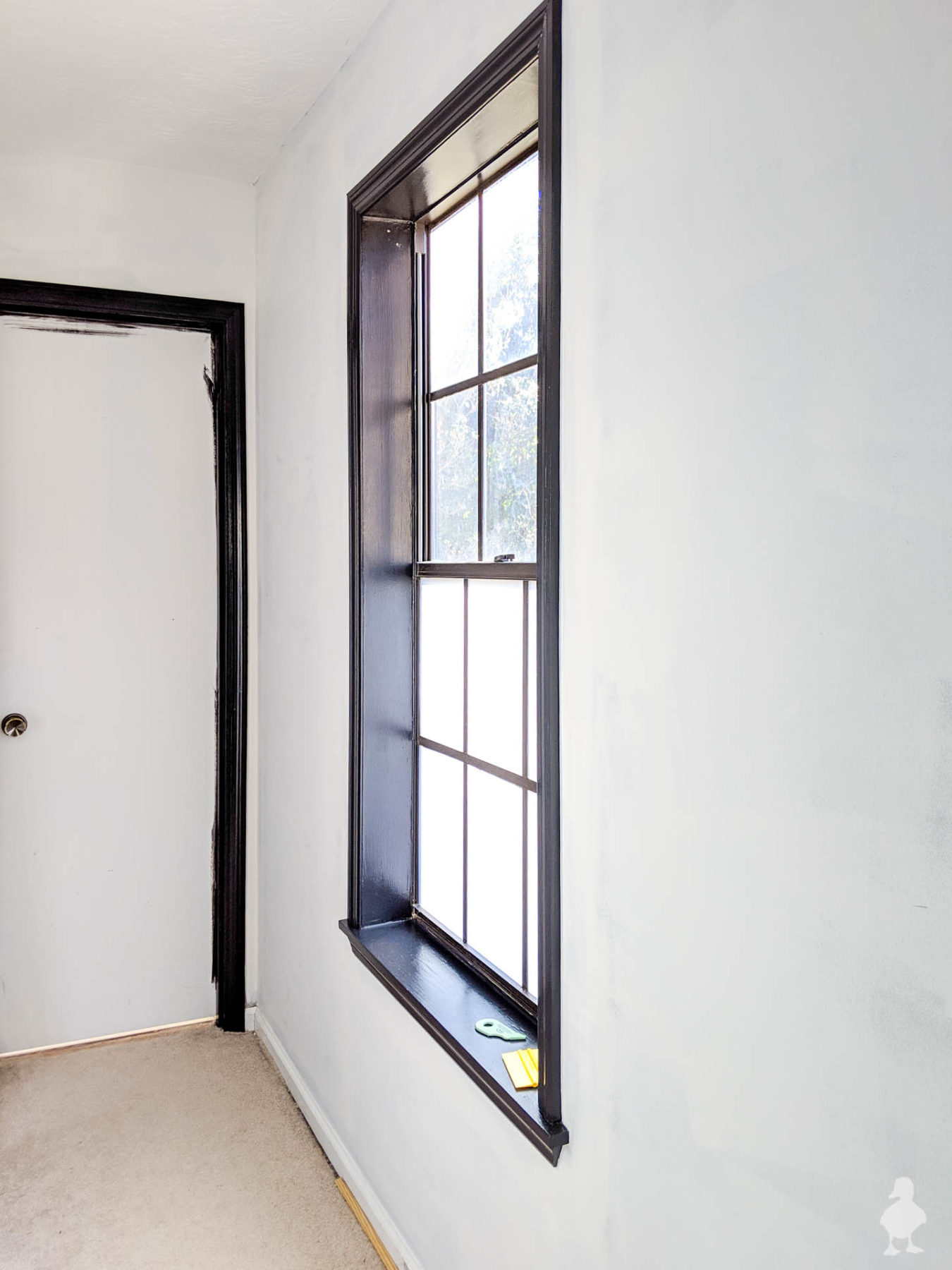
Black trim
After painting the outdoor furniture with Sherwin Williams Tricorn Black, I’m absolutely in love with the color! I immediately began scheming for adding it to the bedroom. I’ll admit, committing to painting my new trim black (remember when I installed it a few years ago?) was a little nerve-wracking at first, but once I saw the first window done, I am totally sold. No regrets on taking the plunge.
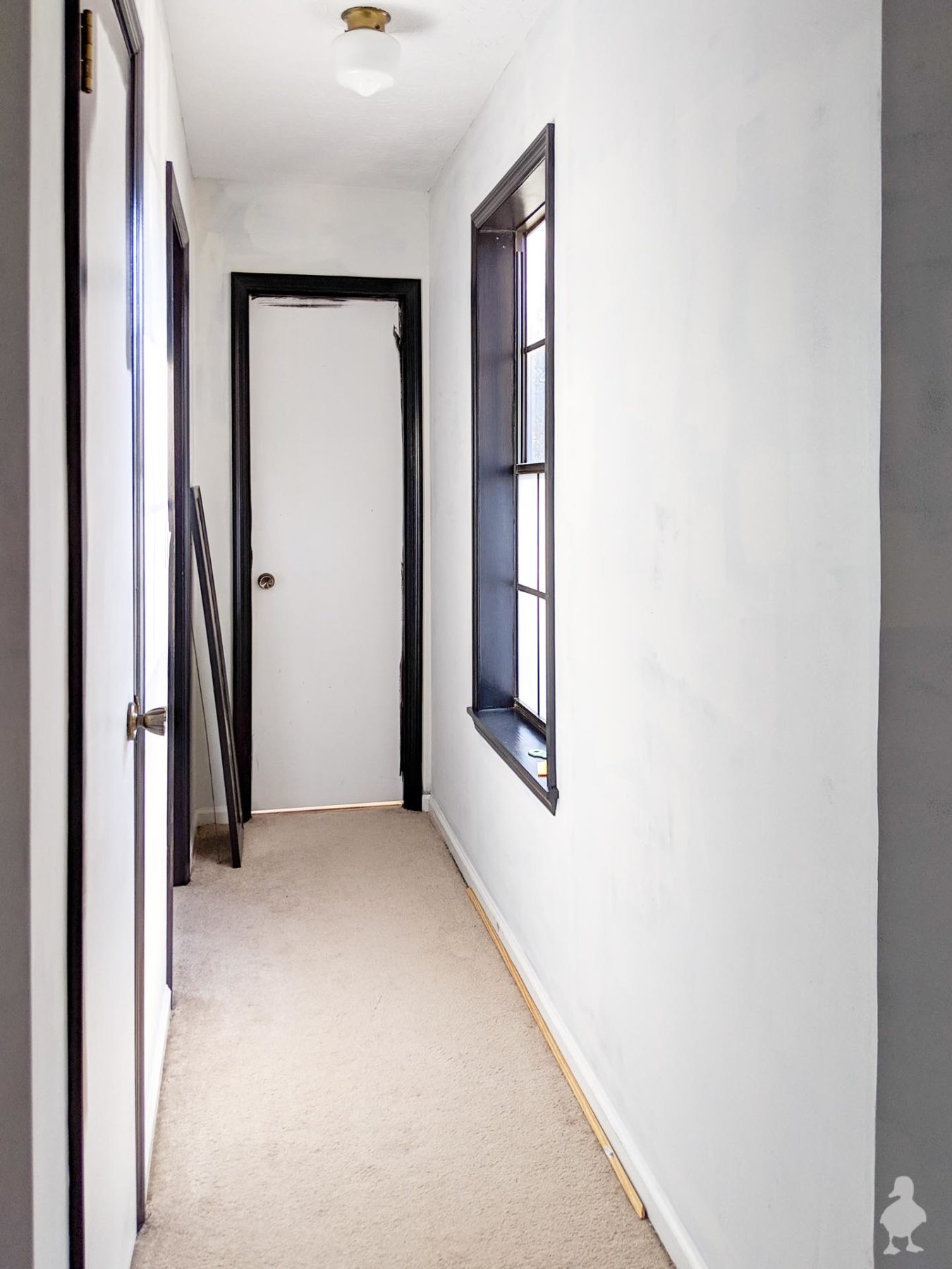
Added window film
This particular update has proven to be a little controversial with some on social media, but it’s my house and I’m going to do what’s best for me! And it WORKED! I added some beautifully blurring-but-still-letting-light-in window film to the hallway and bathroom windows. And I may add it to more.
For a long while, I’ve been trying to figure out what to do about the bedroom hallway window. I want to add blackout curtains to the main cluster of windows, but I wasn’t convinced if I should add one here (maybe a trip hazard?). And yet, I needed privacy, because this window is
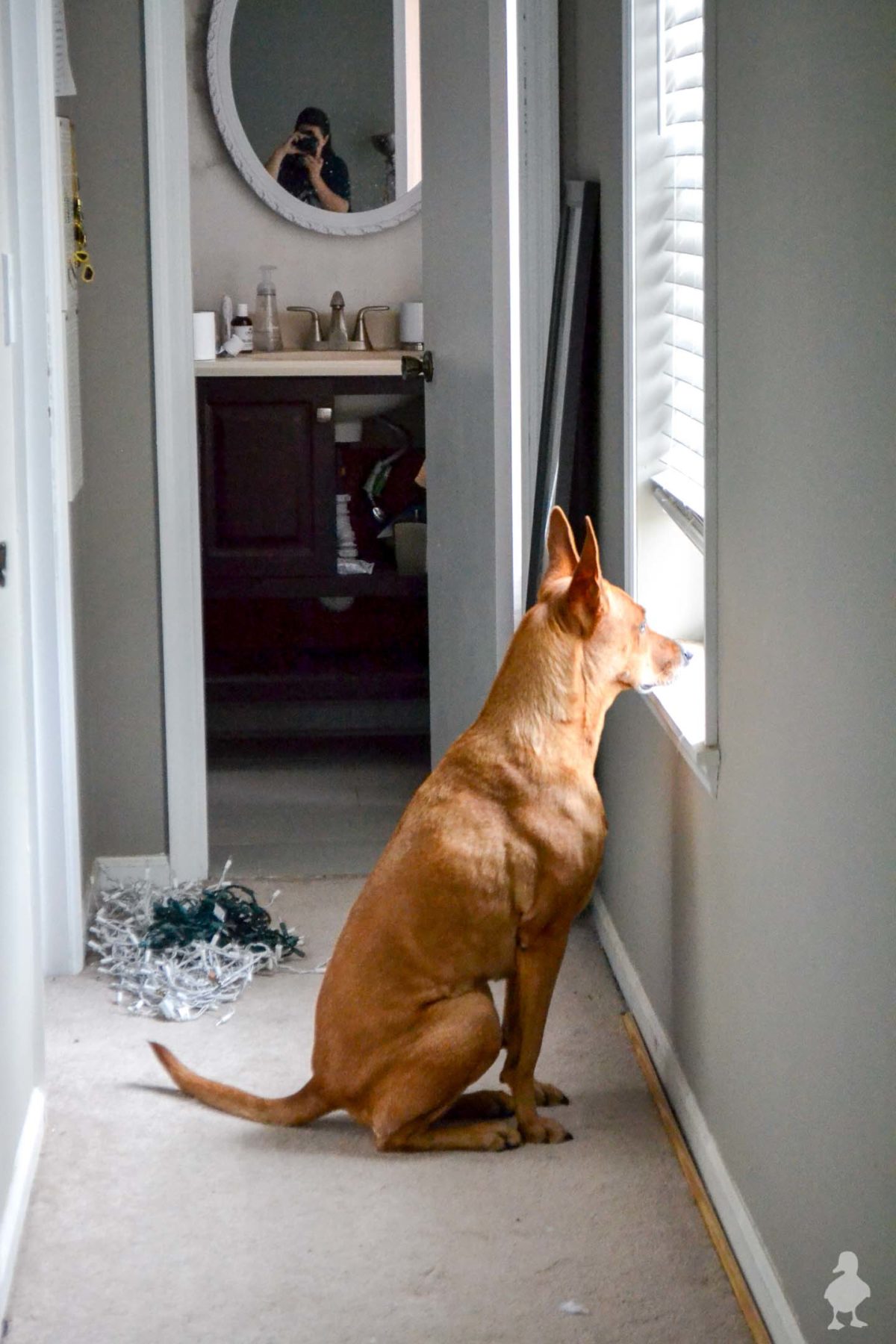
Besides the bareness vs. neighbors issue, this window was also a favorite of Charlie‘s to stand at and bark incessantly at neighbors walking by (I’ve tried to break her of this habit, but after 7 years, I think this is fully baked into her personality). It was driving us crazy because she has a tendency to get Stella riled up in her frenzy, who will join in on the barking from the comfort of our bed — even though she hasn’t seen squat. And my bed is where I like to keep my ears when I’m sleeping. Ya know?
The amazing news, I’m happy to report, is that adding frosted window film to the lower half blurs the view just enough that Charlie doesn’t bother standing at that window anymore. VICTORY! I’ll have a separate tutorial & video on the application for you soon.

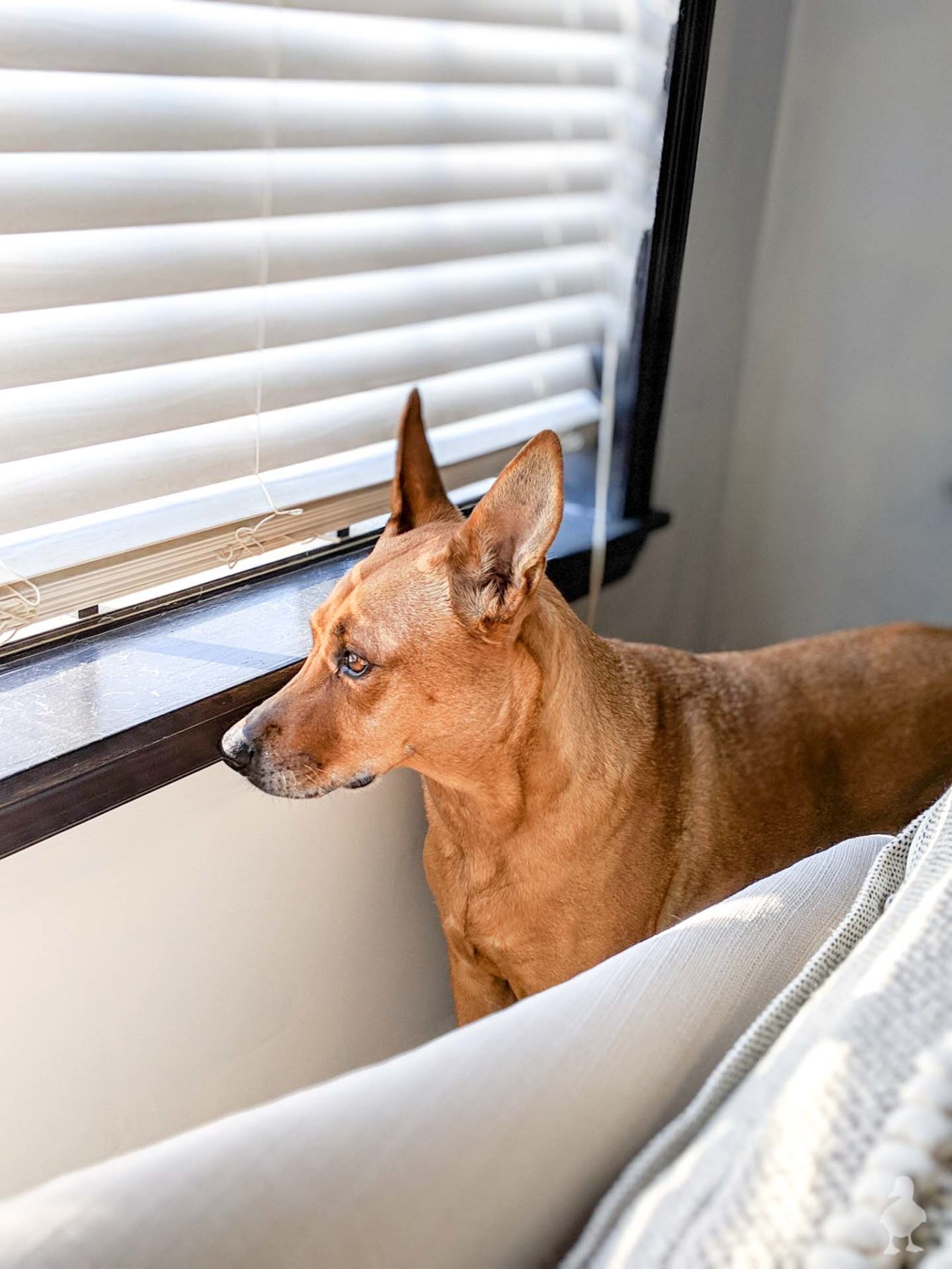
I’m now kind of regretting not doing it
Now, I’m considering adding it to the bottom half of the three remaining windows in the room (because Charlie is not an idiot; she’ll eventually find a new window to stare out). I still want to be able to see out when we want, so I’m thinking of leaving the top without film but some other kind of shade. I’m removing the existing 2-inch blinds I installed when I first moved in because of Charlie, too. Any kind of hanging shade that goes all the way to the bottom will be something that Charlie will interfere with when she looks out of the windows, and that forces me to keep them partially pulled up (or she’ll wreck them — she has broken a slat on one or more of the ones installed, which technically were installed before she came into my life, but it was still an unfortunate and $$$ lesson to learn). So, I think the blurring film option might be the best solution.
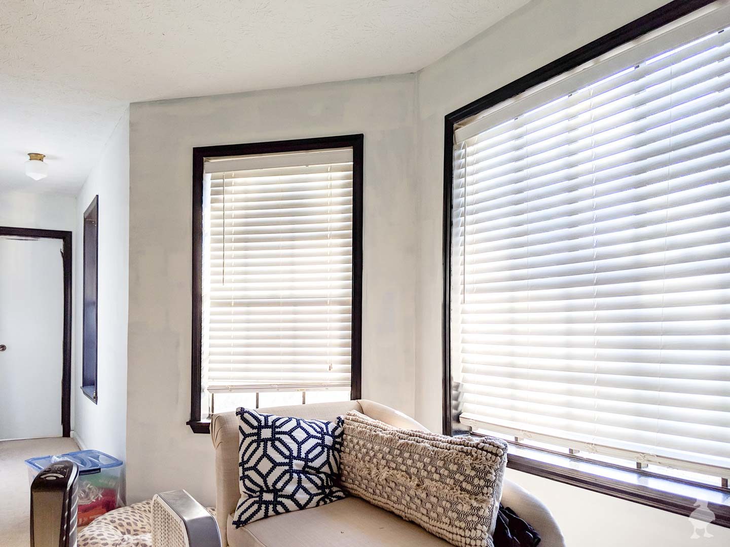
White walls
Finding the right white color of paint was considerably harder than landing on Tricorn Black in semi-gloss finish for the trim color. I scoured the web and Instagram trying to find a good list of color names to take with me to Home Depot to get color matched (being pressed for time, I usually go the color-match route regardless of brand). I tried out Behr White (52), Sherwin-Williams Ibis White, SW Extra White, SW Pure White, and Benjamin-Moore Chantilly Lace.
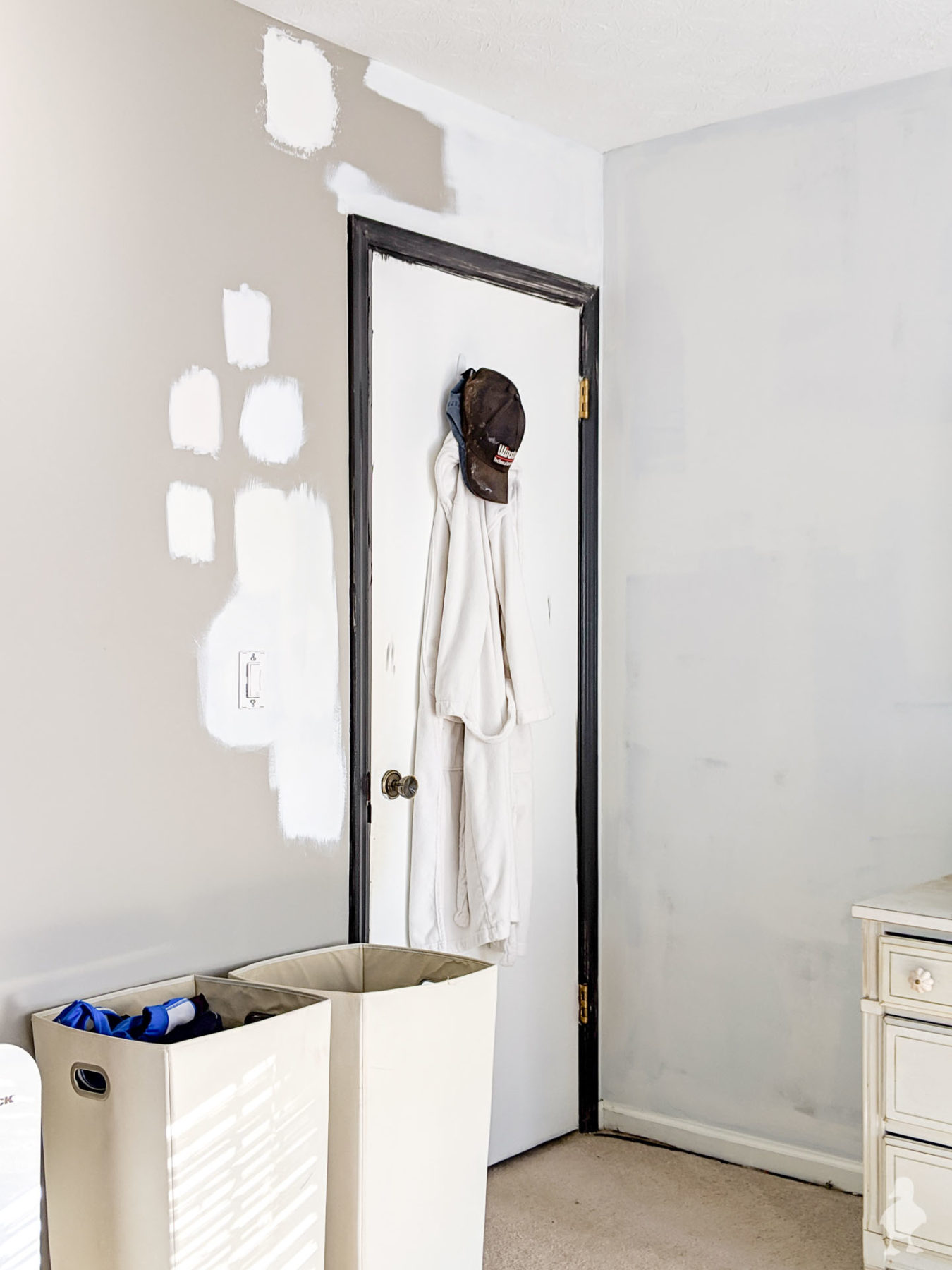
Tip: Always test your paint samples!!! As a general rule of thumb, you simply can’t know how a paint color will make your room look like in your home with your lighting. In my house, everything tends to skew a little yellow, even in natural light. I had high hopes that either Extra White or Pure White would be perfect (as per their reputation from multiple sources), but I was disappointed. The swatch that came out of the Chantilly Lace test pot was the most balanced-looking creamy white on every wall: no pink, gray, green, or yellow undertones. Unfortunately…
Here’s where the not-so-fun part of color swatching comes in: the color mixing department often has multiple “color matched” versions of competitor brands in their system. So, when I chose that Chantilly Lace was my ultimate winner, went back to get it mixed, came home, and threw it on the wall… it was yellowy. As in, a totally different color and not at all the same as my test pot! Womp, womp. Even though I could have taken it back and probably gotten things straightened out with that first can (and if this happens to you, you should), I realized pretty quickly that the “one coat coverage” paint wasn’t going to be one coat at all to completely cover up my gray walls, and I could just use this as the first coat and get the correct color on the second. To avoid any confusion, I’m going to do a color match of the test pot itself to make sure I get the right color (which won’t have a name, so I’ll provide the gallon mix info when I have it).
Tip: I tested out the Behr Marquee paint line, mainly out of curiosity, so I could have some experience using it to pass along to you. My verdict: it’s not worth the extra cost when you’re getting a custom color. The main reason is that the one-coat guarantee ONLY applies to a specific list of colors, so you’re basically not getting any additional coverage-magic when you need a specific color you already like. I’ve always loved Behr paint for quality vs. cost and it’s why I do lot of color-matching to their stuff, but the difference in cost between the Marquee and the Ultra is pretty significant, and I still had to do two coats. So, save your money and get Ultra instead!
Also? There is SO MUCH CUTTING IN with this room! A wrote a tutorial on how to do this without painter’s tape ages ago right here, but even with plenty of practice, it’s a LOT of painting. I didn’t want to remove the builder grade doors from their hinges or take apart the door hardware so cutting in was the winning method. I could spray but taping and covering the floors and white trim to protect them from overspray is a TON more work than just taking my time with a brush. There are FOUR doorways (door to the room, two closets, and bathroom door) and FOUR windows to paint around. These are my favorite tools for this, which you’ll also spot in the video (I actually started doing the trim with another brush and later switched back to what I love because it’s so much better!). The difference between the blue handle and black handle brush is that the bristles on the black one are great for the higher sheen on the trim.
In-Progress Video
Want to see the room makeover in action? Here’s a quick compilation of things so far!
So, as of this update, the paint isn’t done, but there are lots of changes to wake up to lately. Once the wall paint is done, I’m planning on using black door paint (thinking either the same true black as the trim, just in a satin finish, or just a couple of shades lighter?), add a custom trim design to the doors (really looking forward to sharing that tutorial with ya), add a feature wall (!!), switching out some furniture, layering in some decorations, and more. I think the window film tutorial will be the next tutorial I post, so keep your eyes peeled for that!
****UPDATE****
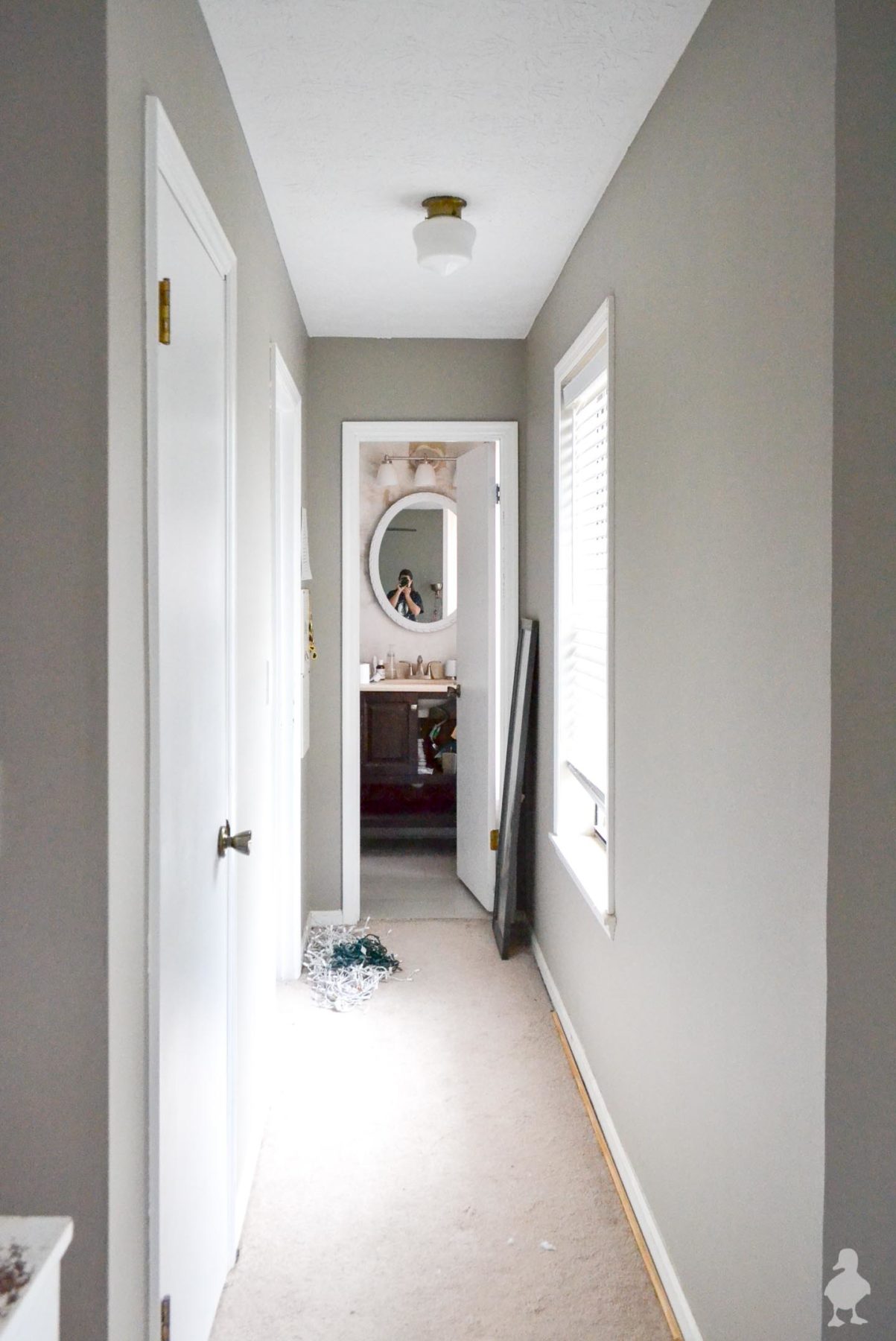
Here’s a progress post, where you can see I still don’t have black interior doors (siiiigh) but I did get things back to functional. Bringing in lots of neutrals makes the space feel a little closer to complete!


Looking great! I did color match once. Not doing again! Last night at HD I noticed they’re separating the Behr whites by undertones! Be still my heart!
That’s fantastic! But it’s still SO tricky in the store to make sure I’m picking up the right swatches. The light always plays a huge difference in what things look like!
I love it! Black trim is outside of my comfort zone, but it’s beautiful in your home!
Thank you Jessie!
Hi there. Picking the right color is only part of the problem. You have to watch the people who are actually adding the color formula to the base paint to make SURE they actually add the entire amount to your paint. I was painting my exterior a soft peach color, found the exact shade at Home Depot. Was watching the boy and noticed that he pulled one color addition down only partially. My BFF was helping me paint and we started as soon as we got to my house. I commented that the painted seemed more “glow in the dark” than soft peach, and my friend assured me that it would look different when dry. It didn’t. I didn’t have the money to repaint, so I became known around the neighborhood and soon people were cruising past slowly just to get a look at the strange color I had painted my place. Just an FYI – WATCH to make sure they pull those formula levers all the way down when adding to your base paint!
You are so right! I am retelling this next chapter in my next post, but my bf tried to pick up a gallon of the same sample color on his way home from work for me (after I began putting the first gallon on my walls, since I knew I’d need two anyway), and the color was totally wrong (again). So, he stood there and watched them mix FOUR separate gallons and none of them matched the test pot (one after the other was either too yellow, too gray, too bluish, etc.). Crazy! They told us that we’d have to go to another store to do a custom color match to that test pot (since it obviously wasn’t matching what they could mix). So, we did. And instead of gambling with gallon after gallon, this guy ingeniously decided to try to match another sample pot exactly as it stated on the label. Only to find out, and here’s the crazy twist: the original paint guy basically never wound up putting tint of any kind in that sample at all. Here I was, going nuts about this mystery white color that was in the sample pot but couldn’t be mixed no matter how hard we tried and couldn’t duplicate with the tint the label said was used, and it was the freaking BASE COLOR with no tint all along. Cue the enormous eyeroll. So, that’s exactly what I’ve been painting my walls with this weekend. I feel like a huge fraud because what design blogger uses plain white straight out of the can?!?! But, in this room, it has an oddly creamy tone that is exactly what I want without it looking too yellow.
Glad to find out I’m not the only one this has happened to. I did wind up painting my exterior a “glow in the dark” white once I got the money. Best choice I ever made – it gleamed! As for the paint matching – I think about the scene from the old movie “Mr. Blandings builds a house” whenever I’m picking colors now. You’ll appreciate that scene and probably find it hysterical.
Love the black trim. I always pick white ceiling fans so that they blend with the ceiling. With 8′ ceilings, it seems to be less intrusive.
I’ll have to look for that movie clip!
I love the idea of black trim, but I know my husband would flip. It looks beautiful though! And I love the idea of the film on the windows. I think I’d do like half my house with it and just get rid of the window coverings all together. But again, my husband would flip.
Oh, also, if you head over to Vintage Revivals blog (not my website), she does most of her trim in Tricorn Black and uses a specific shade of white (she calls it “Mandi White” on the blog, but she gives you the specific formula in one of the posts). I’m not sure if I found both of your blogs separately, or if one lead me to the other, so I have no idea if you have already heard of it. If you love the Chantilly Lace, that’s awesome! Just wanted to give you an option to check out.
Yes, I know Mandi and have DEFINITELY read her post on her favorite white! “Mandi White” is Extra White (one of the colors I sampled) with some extra white pigment added in, which isn’t QUITE Pure White (another sample I tested) but she’s also mentioned that it’s pretty close. I tried out both colors and thought both were slightly too yellow for my walls and found a color that I THOUGHT was Chantilly Lace, only to learn that the sample pot I was using HAD NO TINT IN IT WHATSOEVER. Spoiler! I found this out over the weekend when we went back to compare why the gallon mix didn’t match at ALL to the sample pot (the color I really wanted). So, basically, I wound up using the base white with no extra tint added in, and it just happens to work best for the way light hits this room. So weird! But, to your point, I definitely looked over her rooms and love her use of black trim! She’s got an amazing eye for design.
Love the paint job! This is amazing, Thank you for sharing this with us